The FiXX Design Story
Everything is getting "FiXXED" at Hancock & Abberton..... and I am delighted to share our exciting news
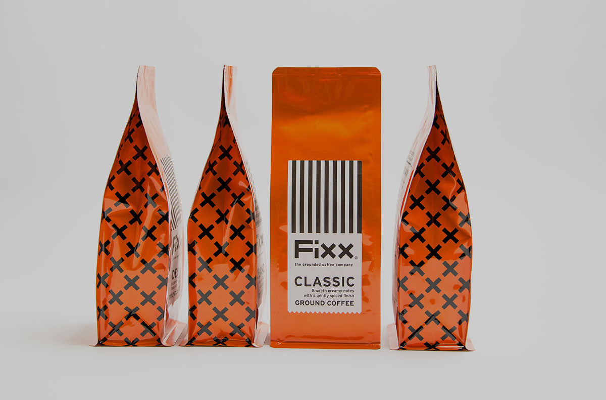
Market research and feedback from customers, confirmed what we instinctively already knew ...... the vibrant orange FiXX brand colour is instantly recognisable, and is the brand that our company is most associated with.
When we decided to FiXX everything, it made perfect sense to engage the team that collaborated with us on the initial FiXX identity.
Mr & Mrs Stevens, a specialist creative brand development studio with a particular focus on food & beverages had a unique insight into FiXX as they created our original tattoo-inspired FiXX logo, (when tattoos were only spotted on sailors, bikers and Buzz Fendall (aka the Bald Barista) our friend and collaborator on the initial FiXX blend.
So 10 years on Mr.& Mrs. were my go-to partners for this "top to toe" revamp of our visual identity. FiXX is moving to centre stage, playing the leading role and under the spotlight, prior to this, it has shared the stage with other brands.
Of course, a rebrand goes much deeper than just a new wardrobe...... Mr. & Mrs. put me through my paces with a couple of their Brand Therapy(TM) sessions, exploring backgrounds, customer profiles, brand values, positioning and ultimately establishing the crucial tone-of-voice for FiXX 2.0.
The outcome was clear; FiXX is a no-nonsense, down to earth brand that is passionate about product but eschews any coffee-nerdery
Mr. & Mrs. wanted to create a truly distinctive, bold new look for FiXX and I shared their ambition. It was agreed that both the vibrant orange and the name should be retained. FiXX was first to the coffee market all those years ago with vibrant orange packaging. We take it as a compliment that so many others followed by using the same colours. Nevertheless orange remains strongly associated with FiXX and we are keeping it that way. All of our designs, colours and wordmarks are protected and trademarked.
Fonts were scrutinised but eventually Mr. & Mrs. decided to build our own wordmark from scratch, FiXX is a practical and pragmatic brand so it made sense to do it this way. Taking one simple form - a rectangular block they then constructed all elements of the word F i X X. The end result is strong and satisfying. Just like the coffee...
While Mrs. Stevens (Siobhan) began to explore how to differentiate our range of blends by design, Mr. Stevens (Conor) got to crafting copy. We needed a brand line that was at once descriptive but that positioned us in an increasingly cluttered and confusing market. ‘The grounded coffee company’ was the elegantly simple solution. The play on words amplifying one of our brand values “good-humoured”, as well as communicating our grounded approach.
FiXX is confident and clear so the design system needed to be too, one that could be easily understood by consumers scanning a shelf. By not taking the obvious route of colour coding we challenged ourselves to adhere to the minimal colour palette. Using that basic building block from our wordmark as the starting point a suite of simple, graphic patterns to denote each blend emerged.
- CLASSIC = straight up, the original FiXX Blend
- DECAF = hazard slashes for ‘NO’ caffeine
- ORGANIC = leaf veins to denote the organic characteristic
- CUBANO = cubes from the word Cuba
- OSLO = flag of Norway
- SEATTLE = rain/rainfall associated with this city
- LISBON = classic Portuguese azulejos tile patterns
- SINGLE ORIGIN = the figure 1 repeated – one origin
There is also a story behind the naming of the blends but that is for another blog!!
With the key brand pieces in place; visual identity, brand line, tone of voice, Mr. & Mrs. continue to work with us as we apply the new visual identity on the multiple applications from business cards to crockery to shipping cartons to social media avatars, the list goes on ..... but that’s ok, we are enjoying the process . Thank you for your patience as we transition from the Old to the New and I sincerely hope you like what we have done.
Anne Abberton


